A branding project blending aesthetic research and artisanal care, across materials, print, and digital communication.
A branding project blending aesthetic research and artisanal care, across materials, print, and digital communication.
SERVICE
Visual identity & graphic design
role

THE PROJECT
Aputea Design was born from the desire to combine aesthetic research and rigorous design practice with meticulous attention to materials, printing techniques, and craftsmanship. Every visual choice comes from a research process that favors lasting quality over passing trends, building an identity meant to endure.
LOGO & TYPOGRAPHY
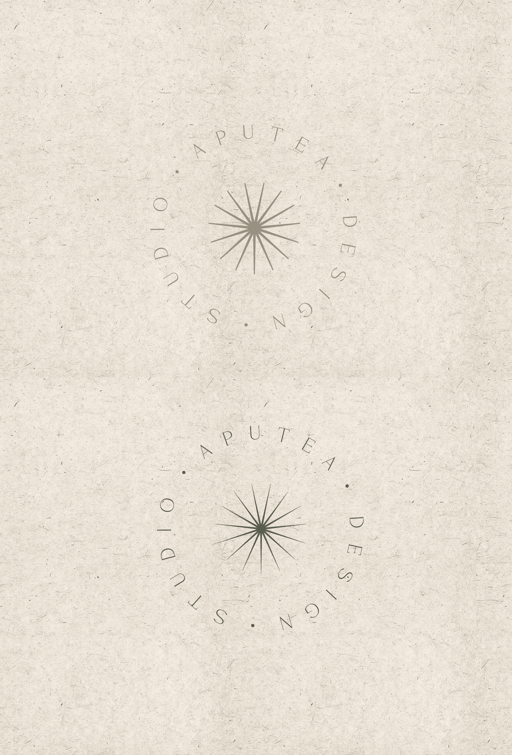
The spark is a simple yet distinctive visual accent: it represents care, uniqueness, and elegance, adding personality to the logo without weighing it down. It was designed as a detail that reveals itself only to a careful eye, reflecting the idea that true quality shows in the details, not in excess.
A serif lowercase typeface blends classic elegance with contemporary simplicity, keeping a refined yet approachable tone. The lowercase choice communicates informality and closeness,
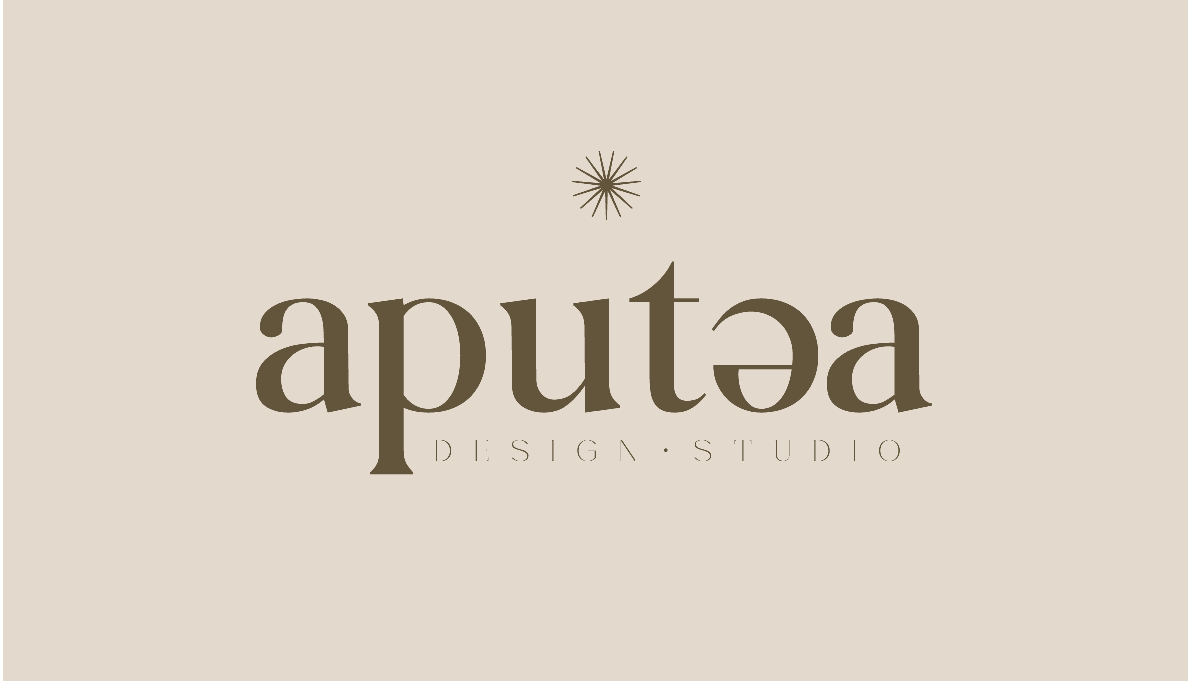
A serif lowercase typeface blends classic elegance with contemporary simplicity, keeping a refined yet approachable tone. The lowercase choice communicates informality and closeness, while the serif recalls a craft and typographic tradition without feeling dated.
PALETTE
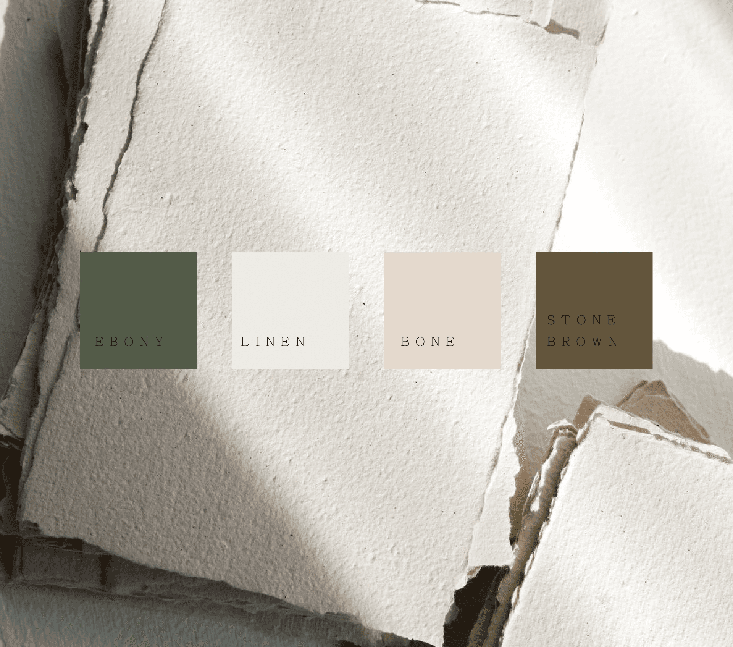
The color palette draws from the tones of paper and raw materials, evoking natural textures and tactile sensations. Neutral, soft tones create a delicate, authentic, and refined aesthetic, in line with the project's artisanal approach. The desaturated color choice also allows the brand to adapt across different contexts and materials without ever feeling intrusive.


DIGITAL
The digital presence of Aputea Design was developed to clearly communicate services, products, and materials through a clean, cohesive visual language. The project includes a showcase website and a consistent presence on Instagram and TikTok, where content and graphics reflect the brand's tone of voice and target audience. The goal was to maintain continuity between the physical experience of the materials and the digital one, so the brand remains recognizable at every touchpoint.
SOCIAL CONTENT
Aputea Design's social communication is conceived as a natural extension of the brand's identity: every piece of content — whether a process reel or a still-life shot — maintains the same visual care and refined tone as the graphic project. Instagram and TikTok become spaces to tell the behind-the-scenes story of the artisanal work: from choosing the paper to crafting the details, all the way to the finished packaging. A dynamic, close-up video format highlights textures and materials, bringing the audience closer to the creative process in an authentic and immediate way.


