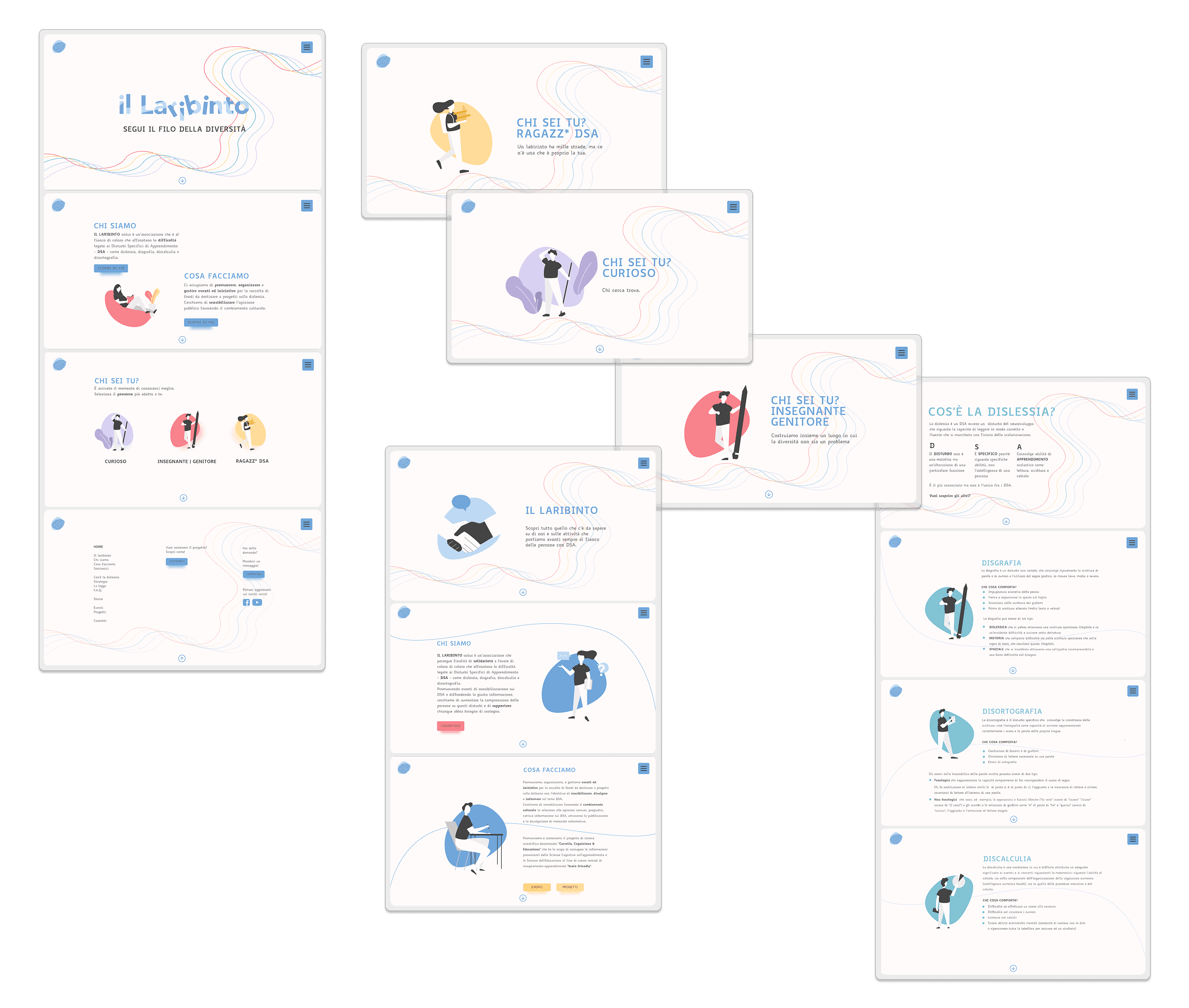
dyslexia association website redesign
Il Laribinto is an association supporting people with Specific Learning Disorders, redesigned from user research through to a dyslexia-friendly, fully accessible website.
SERVICE
UX DESIGN / DEV
role
UX/UI Designer & Front-End Developer


1. Concept & Intentions
A maze is traditionally a place where finding the right path is difficult — our vision for Il Laribinto was the opposite: creating a digital space where information is easy to find and users feel understood, supported, and empowered. Starting from the association's existing website, the project aimed to redesign the platform with accessibility and inclusivity at its core, using clear content organization, accessible visual design, and highly legible typography.
2. Research & Approach
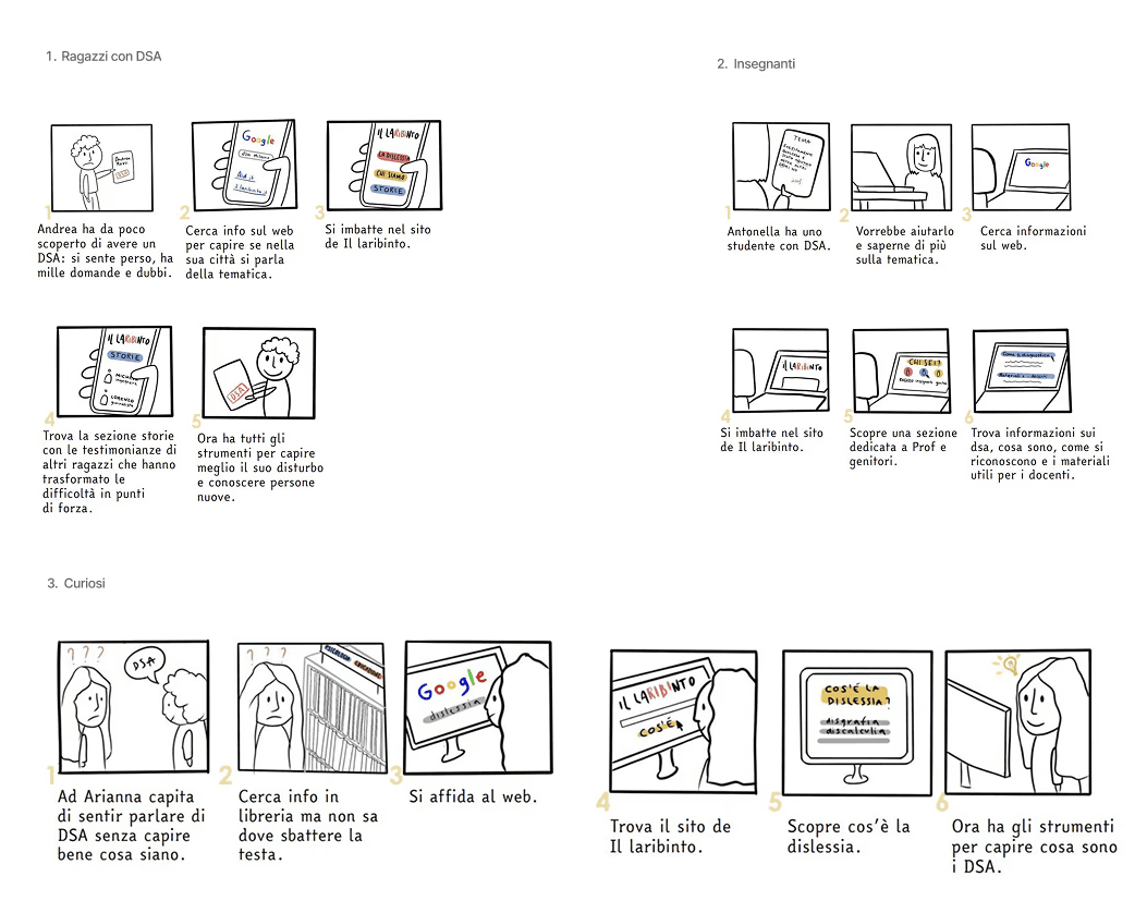
To better understand user needs, motivations, and expectations, I identified three primary target groups: young people with SLD looking for support and practical resources, parents and education professionals seeking guidance and reliable information, and a general audience interested in learning more about SLD and neurodiversity. I created a series of user stories and storyboards to visualize their needs and potential navigation paths, defining key scenarios and design priorities.
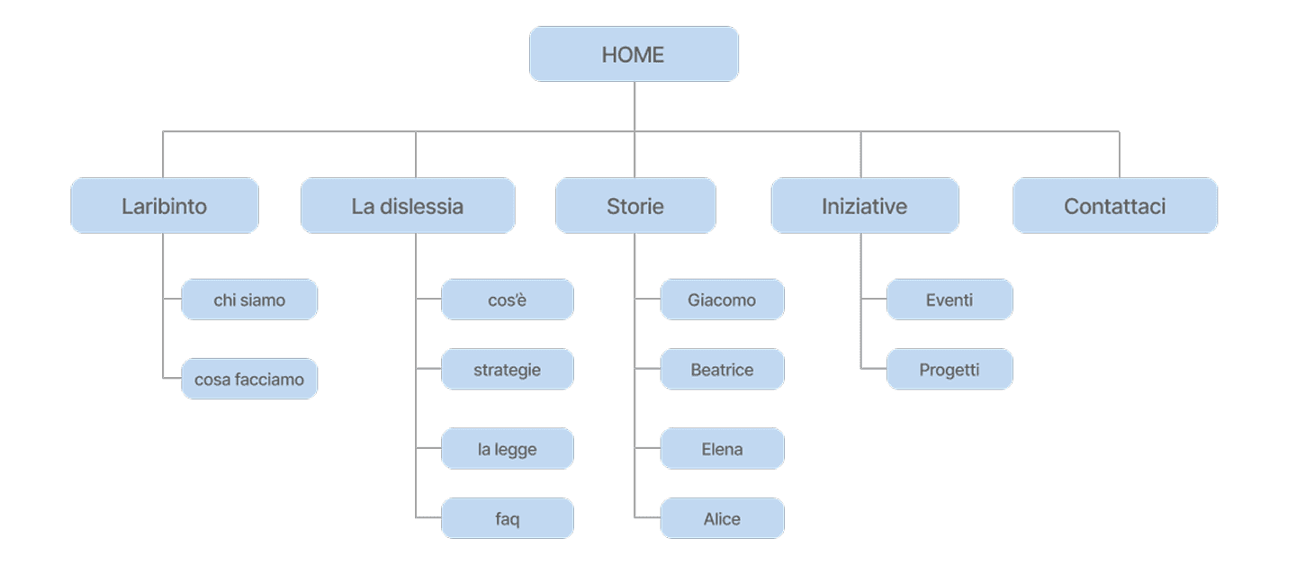
An audit of the existing website revealed a large amount of fragmented content and several navigation issues affecting the overall experience. To improve clarity and discoverability, I redesigned and simplified the information architecture — removing redundant sections, renaming unclear labels, improving content hierarchy, and creating more intuitive navigation paths — and introduced two new sections: Stories, for testimonials from people with SLD, and FAQ, for accessible answers to common questions.

3. Design
The wireframing phase focused on transforming the new information architecture into intuitive, accessible interfaces, with particular attention to reducing cognitive load and supporting users throughout their navigation journey — introducing contextual shortcuts to related content and a persistent navigation menu.
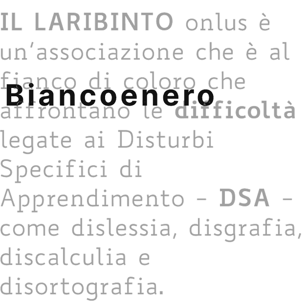
Accessibility was the guiding principle throughout the visual design. I adopted Biancoenero®, the first Italian typeface designed specifically for readability and dyslexia-friendly letterforms — distinguishing easily confused characters like b–d, p–q, l–I — paired with a color palette that avoided pure black and optical white in favor of softer, fatigue-reducing tones at accessibility-compliant contrast.
I also redesigned the visual identity (updated logo, custom illustrations) and developed responsive mockups for desktop, tablet, and mobile, incorporating real stories and testimonials from people with SLD into the new content structure. Finally, I built the final site myself using Bootstrap, translating these accessibility principles directly into development.