NFT & event ticketing marketplace
A confidential Web3 startup building a more transparent ticketing ecosystem — designed from wireframes through to a tested, brand-adapted high-fidelity product.
SERVICE
UX/UI Design
role
UI Designer


1. Concept & Intentions
This project was developed for a confidential startup operating in the event-ticketing and Web3 space. The company's mission is to create a more transparent and equitable ticketing ecosystem, enhancing the user experience through NFT-based tickets that users can collect, transfer, and easily manage.
2. Research & Approach
2. Research & Approach
Based on the data and insights provided by the company, I translated the identified user needs and requirements into wireframes for both the application and the website, covering desktop and mobile versions. This process focused on creating intuitive user flows and a clear information architecture across all platforms.
The company provided a set of foundational brand identity elements, including the colour palette and other basic visual guidelines, which served as a starting point for the digital experience. Building on these foundations, I developed the overall aesthetic and visual language of the app and website, adapting the brand to the specific requirements of a digital product.
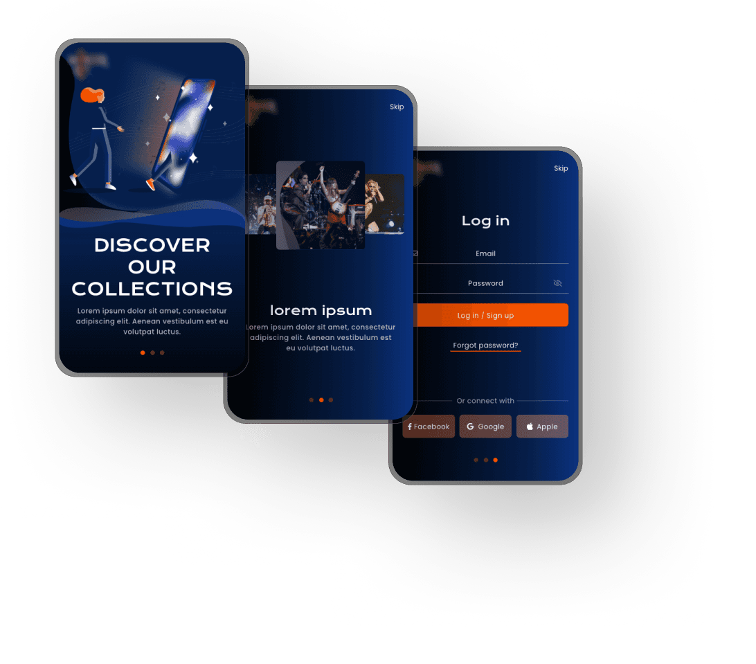
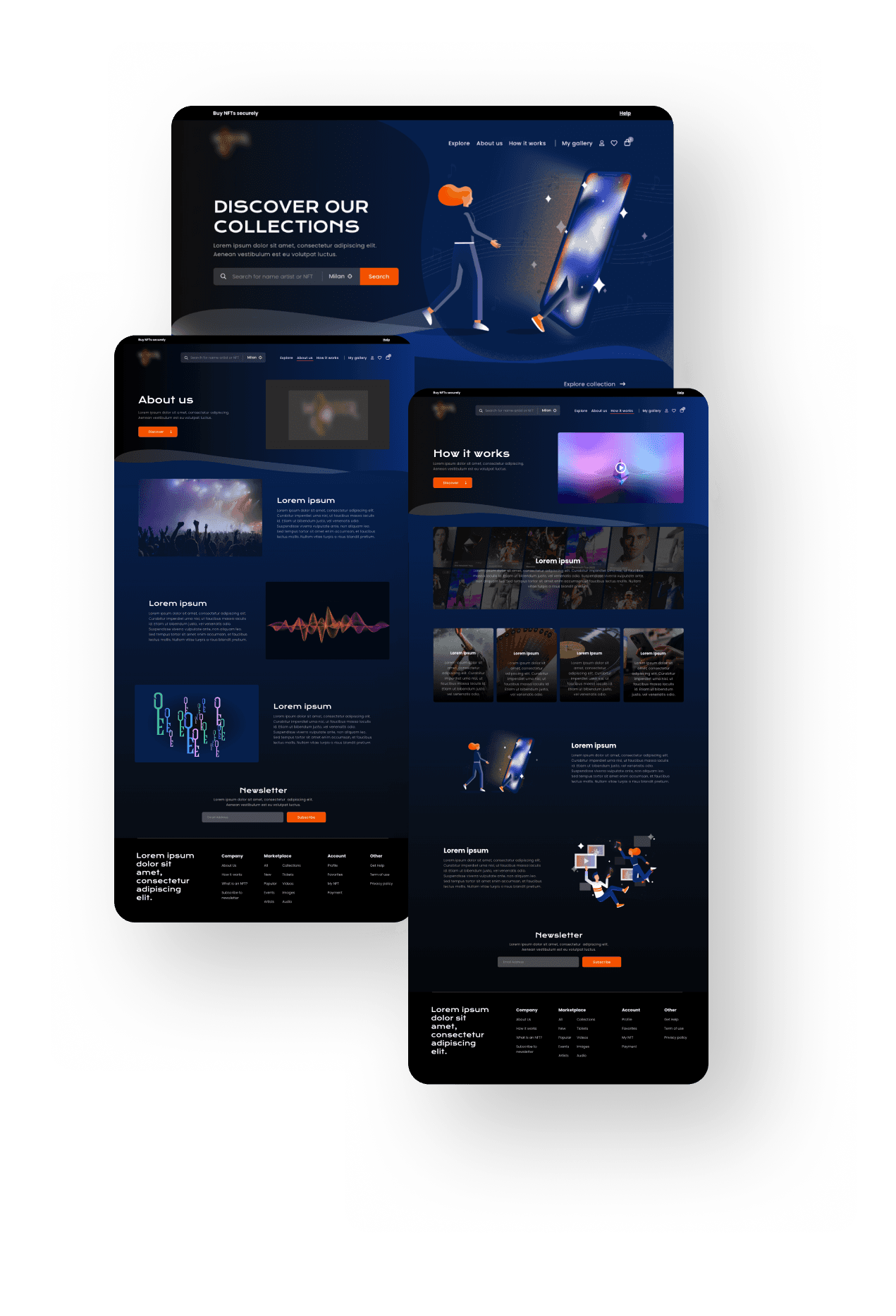
To create a distinctive and contemporary visual identity, I introduced flowing graphic lines inspired by modern audio equalizers, layered layouts with overlapping elements to add depth, web-optimised typefaces for improved readability, and custom illustrations that contributed to the brand's personality. These elements were developed to create a cohesive and recognisable visual system while ensuring readability, accessibility, and usability across platforms.

3. Design
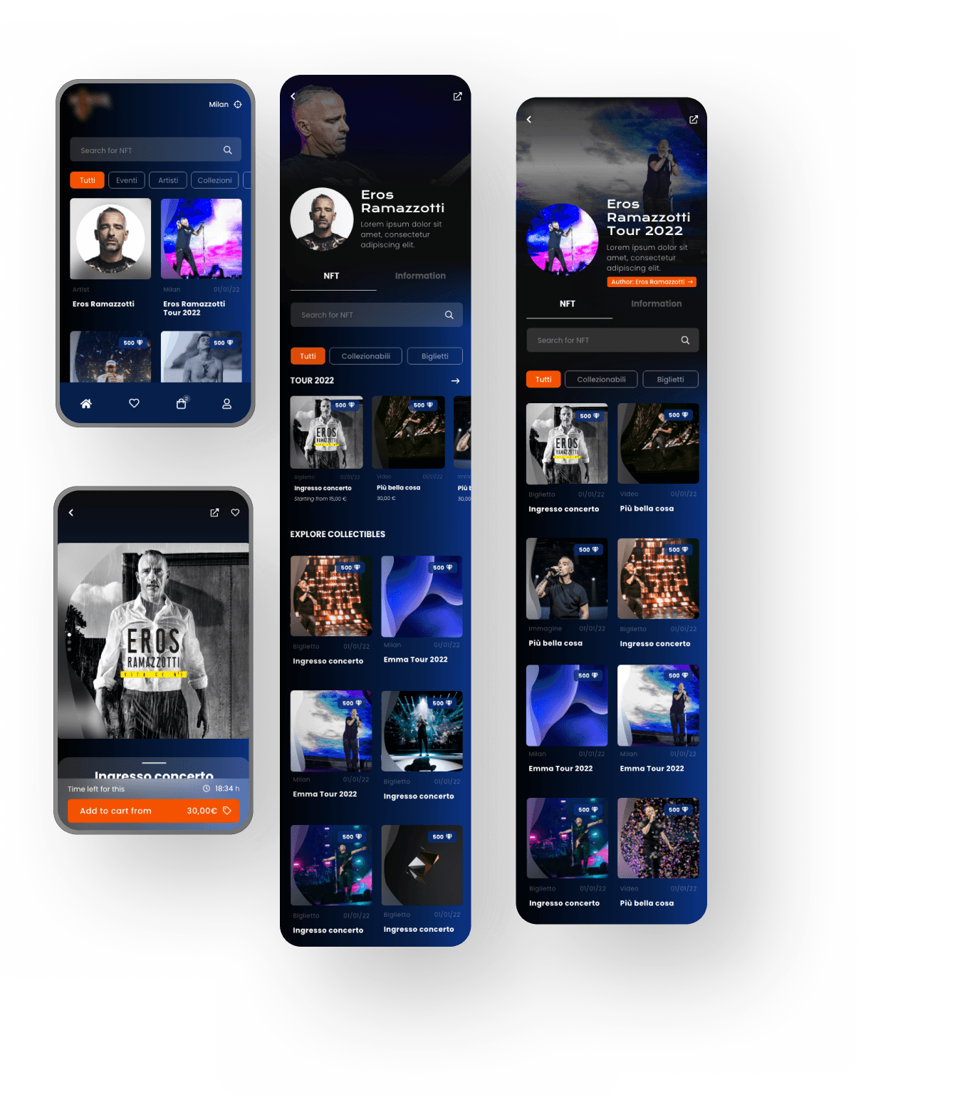
Once the visual identity was integrated into the wireframes, I developed high-fidelity mockups for both the website and the app, refining the information hierarchy and simplifying interaction flows to improve the visibility of primary actions — such as the ticket purchasing call-to-action — alongside accessibility and responsiveness checks across desktop, tablet, and mobile.
4. Outcome
The final mockups resulted in a more intuitive, accessible, and user-friendly product — bringing a mainstream-friendly UX to a Web3 ticketing experience.


